This is the story of three people living in three different countries, connected by a shared love for climate and geospatial data. We had never met in person, but the Code for Earth challenge brought us together and gave us the chance to collaborate on an exciting project: making fire probability forecast data more accessible and usable.
It’s also the story of a brave and dedicated group of mentors who supported us throughout our four-month journey, helping us turn a simple idea into a concrete goal.
But let’s proceed in order.
Why we built it
Every fire season seems to bring a new round of dramatic conditions. Entire regions face evacuations, ecosystems are devastated, and communities wonder how these events escalated so quickly. Behind those conditions there is an urgent question: can we predict where fires are likely to occur, and can we do it early enough to prepare?
ECMWF has developed two powerful new global fire-probability indexes that can help answer this question. They contain scientific insights and undergo continuous development. Progress is being made toward making these openly available to users.
Our goal with the Fire Front Radar app was to bridge that gap by transforming these datasets into an interactive dashboard that researchers, local municipalities, and governmental agencies could navigate with confidence. Instead of static maps or dense documentation, we wanted a living, dynamic tool: something that makes sense at first glance but invites deeper exploration.
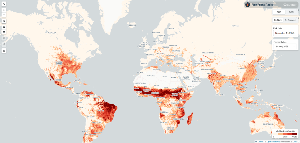
The app’s landing page, featuring a global map of POF index values. Data is visualized through a color gradient, ranging from light (low risk) to dark red (high risk).
Turning fire models into insight
To build the platform, we worked with two innovative indices produced by ECMWF. The first, the Fire Occurrence Probability Index (FOPI), offers a major improvement over traditional forecasting. Older models often relied on weather alone. FOPI goes further by incorporating satellite observations that track vegetation health and moisture. This matters because dryness alone doesn’t tell the whole story. A desert may be dry, but without vegetation, there’s nothing to burn. FOPI filters out these false alarms and highlights regions where both dryness and vegetation come together to create a genuine fire danger. It gives users a more realistic picture of where ignition is actually possible.
The second index, the Probability of Fire (PoF), adds an even more sophisticated layer. It uses machine learning to forecast wildfire activity up to ten days in advance at a resolution of about nine kilometers. PoF pulls information from many different sources—weather patterns, land cover, fuel types, and satellite fire observations—to make its predictions. It can be used for real-time monitoring, for examining past fire events, and even for exploring wildfire patterns over longer climate timescales.
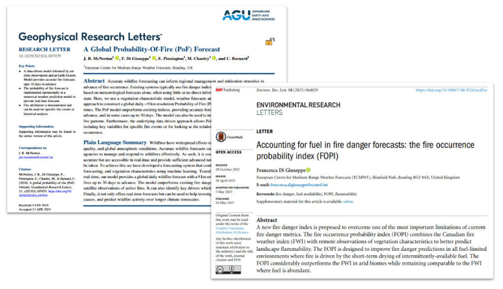
Opening pages of the research papers introducing the POF and FOP indexes.
Working with these two models allowed us to create a dashboard that doesn’t just show where fire risk might be high today, it also helps users to evaluate the model across time for the past events. This is the final result of our efforts: https://apps.copernicus-climate.eu/c3s-apps/pyroscope/
Building the dashboard
Turning all those datasets into a smooth, interactive experience wasn’t something we solved on the first try. We experimented with a few different approaches, and the size of the data—several gigabytes—kept slowing us down. It took a few weeks before we found a setup that behaved the way we wanted.
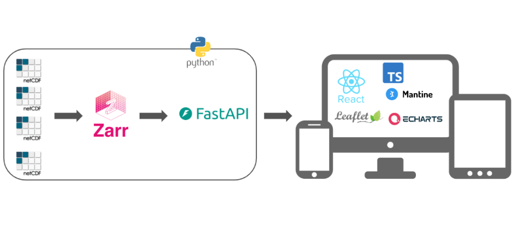
Diagram of the application architecture: the left block represents the backend stack, while the right block displays the frontend libraries and frameworks.
Most of the heavy work happens in the backend, which we built with Python and FastAPI. That layer serves the fire-related NetCDF data, exposes the various endpoints, and generates heatmaps whenever someone changes a filter or a new date. One of the more consequential decisions was to convert the original NetCDF files into the Zarr format. Because Zarr stores data in small, cloud-friendly chunks, it sped up access and made the whole system be more responsive.
On the frontend, we used TypeScript with React to create a responsive interface that feels light and welcoming. Leaflet gave us the mapping foundation we needed to display global datasets, while the Mantine UI library provided clean and accessible interface components and Apache ECharts library the backbone for the charts.
With this system in place, users can zoom across continents, move between dates, and explore daily forecasts without experiencing (too) long load times.
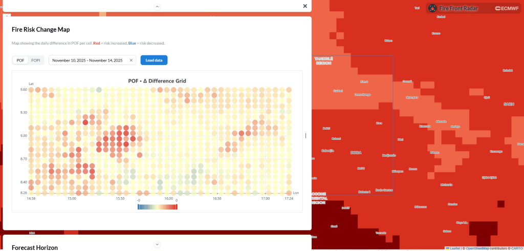
Detail of the visualizations for a selected zone. Based on geographical and temporal parameters, these charts display the POF and FOPI values. The fire risk change chart pictured illustrates the daily index variance for each geographic cell.
Looking ahead
Currently, the Fire Front Radar serves as a tool for the ECMWF team, allowing them to quickly evaluate and validate the accuracy of their models during their daily routines. However, this is just the first step. Our hope is that this project will continue to evolve, eventually extending its reach beyond the lab to support a broader audience of researchers, local municipalities and governmental agencies in their efforts to monitor and manage fire risk worldwide.
Lessons for newcomers
The Code for Earth challenge is an invaluable experience, and we highly recommend it. From our perspective, collaboration played a central role from start to finish. Each of us came from a different background and that diversity shaped the project. Translating scientific concepts into a digital interface required constant dialogue, iteration, and openness. It wasn’t just about accuracy or aesthetics, but about finding the right balance that allowed both to coexist.
George Begkas, Marina Caporlingua, Lucy Colley
Made with love ❤️ with our mentors: Christopher Barnard, Edward Comyn-Platt, Douglas Kelley, Joe McNorton, Mark Parrington